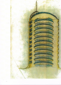

 The image below is a revision for an enclosed top floor. I don't know why but this sketch reminds me of drawings by Mendolsohn...
 These two sketches (above and below)are interesting...a shorter building design and below, it featured open balconies...are those spotlights shining into the sky? It appears there are semi-circular fence elements on the surrounding stone wall... perhaps to tie in with the balcony railing and the top of the roof deck enclosure that looks a lot like the skylight in Wright's Guggenheim?
 The sketch above is an early perspective with "clunky" elevator towers that look awkward compared to the more refined later perspectives...Carl would often sketch at the top of the paper and have a lot of white space before you see the name of the project at the bottom, almost in the same way as Wright used the Japanese woodblock techniques in many of his earlier perspectives. Note the "inverted-L house" is omitted from the drawing.Once the final design concept was in place Carl built this model to help the client visualize the building...With an enormous number of drawings and effort expended, the client started to lose money on other investments, the early 1980's were an economic mess. Concurrently, he started losing interest in the building, which would have been complicated and expensive to build...he stopped paying Carl and during litigation the client committed suicide...
Below- This "Typical" floor plan is easier to read than the previous ones...


No comments:
Post a Comment